|
Developer: IO Interactive |
As with any followup there were strong foundations already put in place. We wanted to restyle and improve the main menu and games general HUD without reinventing the wheel. |

Quick navigation overview of the HITMAN 2 main menu
Main menu comparison of HITMAN and HITMAN 2.
We wanted to make the the destination menu more lush with focus on one location and bigger images.
Mission briefings were also updated with new images and less non essential information.

Basic HUD comparison.
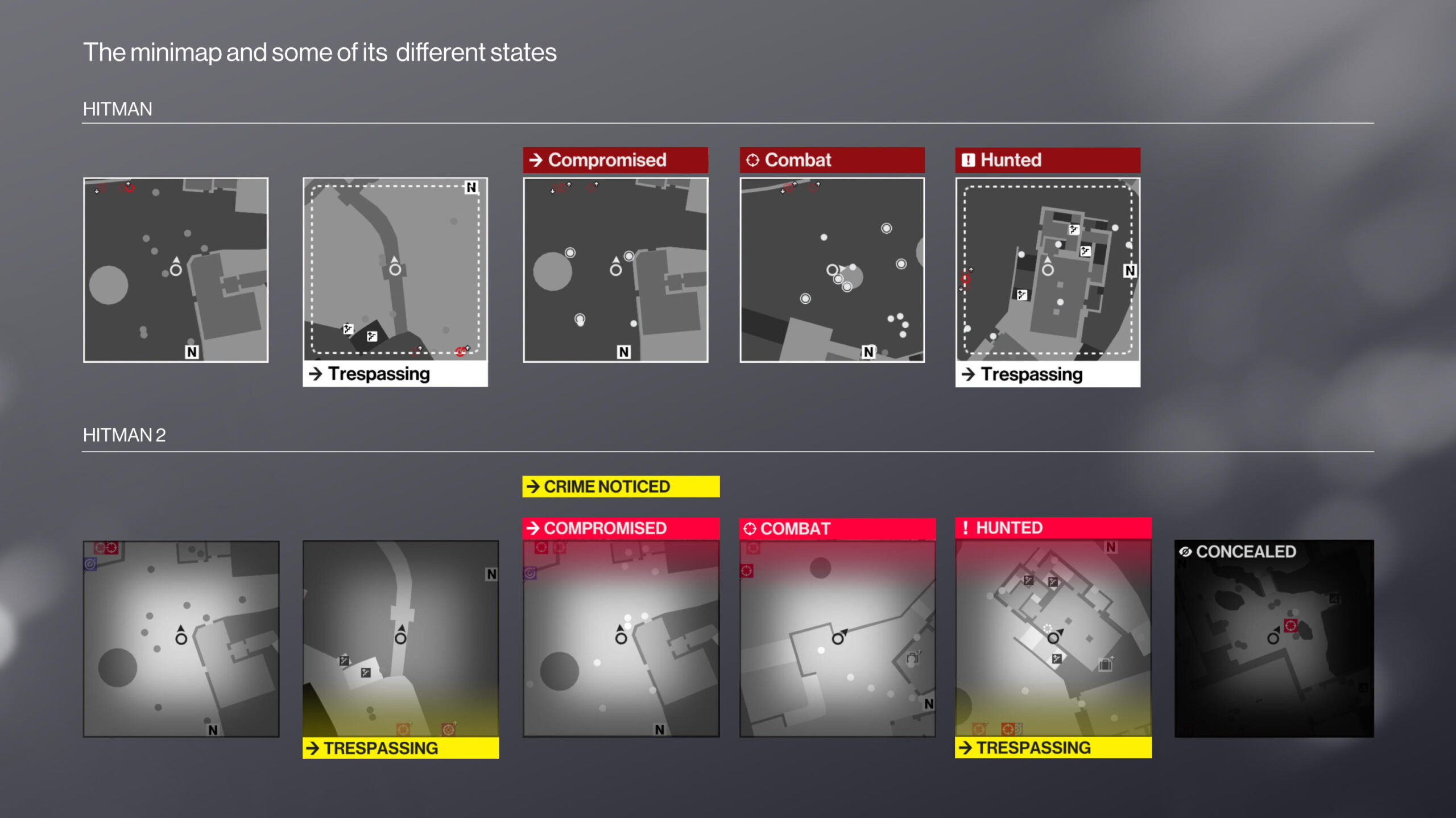
We observed that players often did not spot information displayed around the minimap.
By using bright colors more players noticed they were trespassing or compromised leading to less frustration.
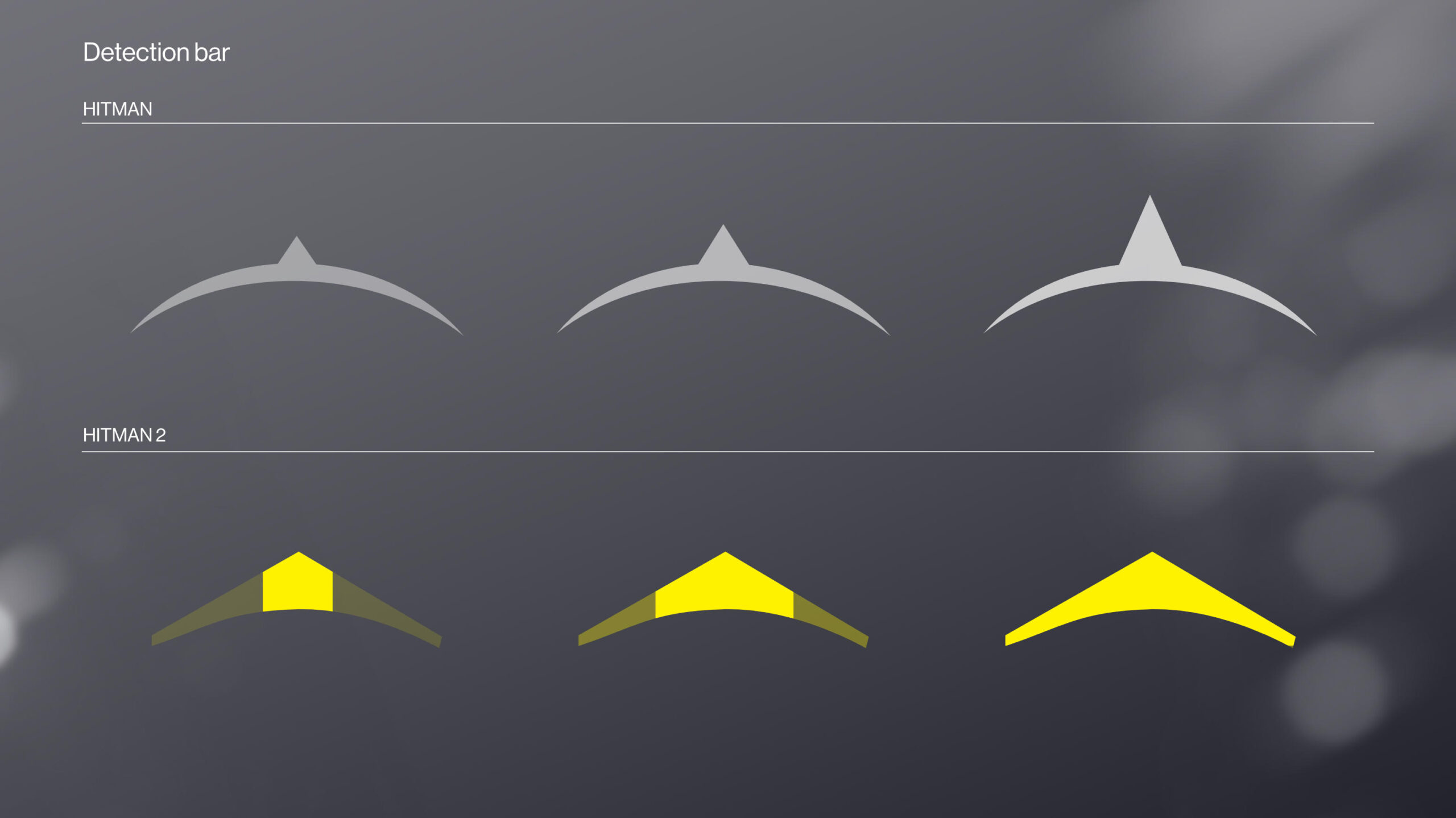
We changed the detection bar as in the first HITMAN game, it was very hard to judge when the triangle was at its peak and you would be detected.
Having an area that filled up gave players greater insight into this mechanic.
Inventory screen was diminished so the game was less obscured and players could tactically pause and plan out their next move.

As HITMAN levels are meant to be replayed multiple times, we wanted to surface how many challenges there were yet to be accomplished.
The challenge mosaic became quite popular among players.

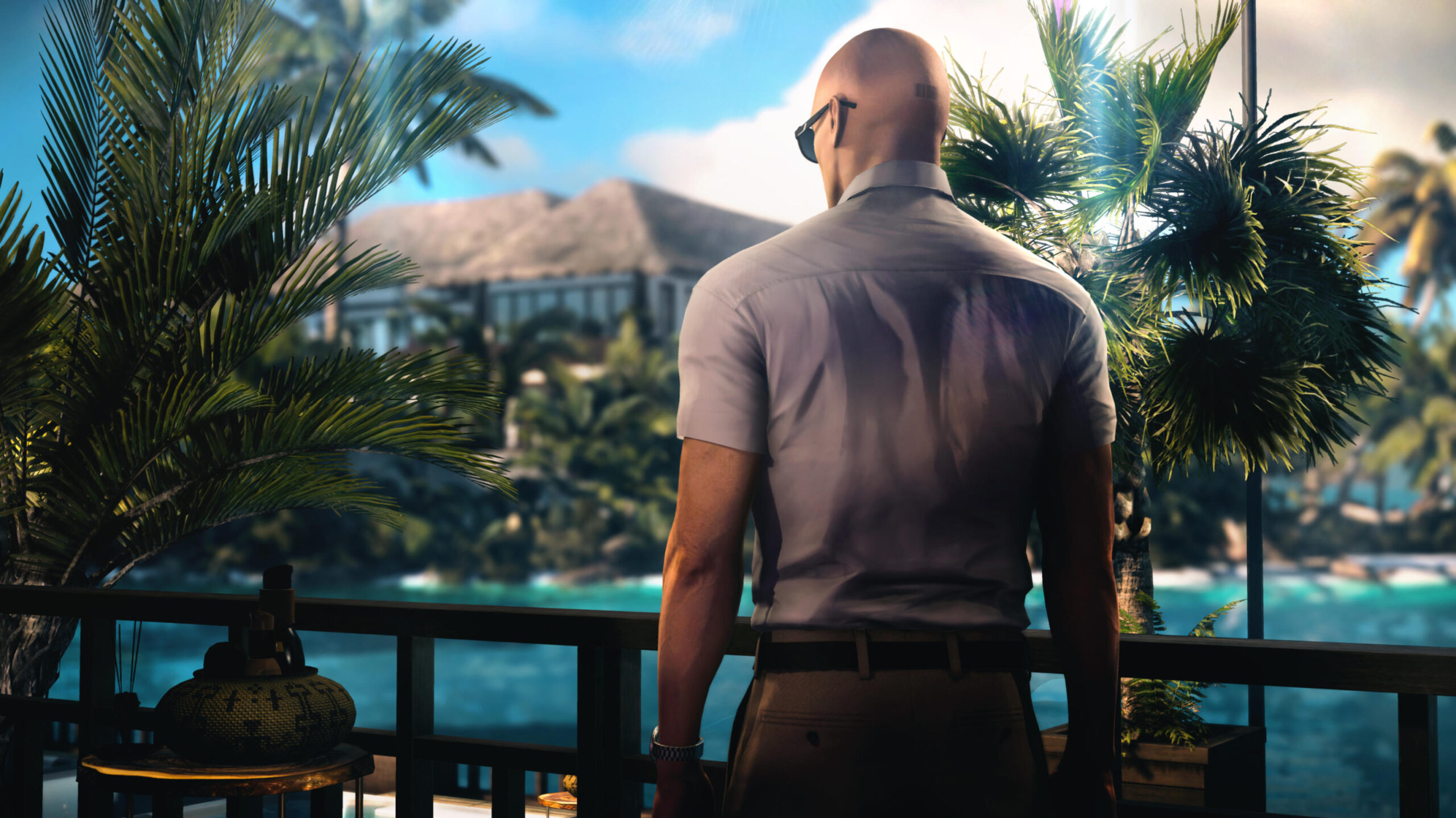
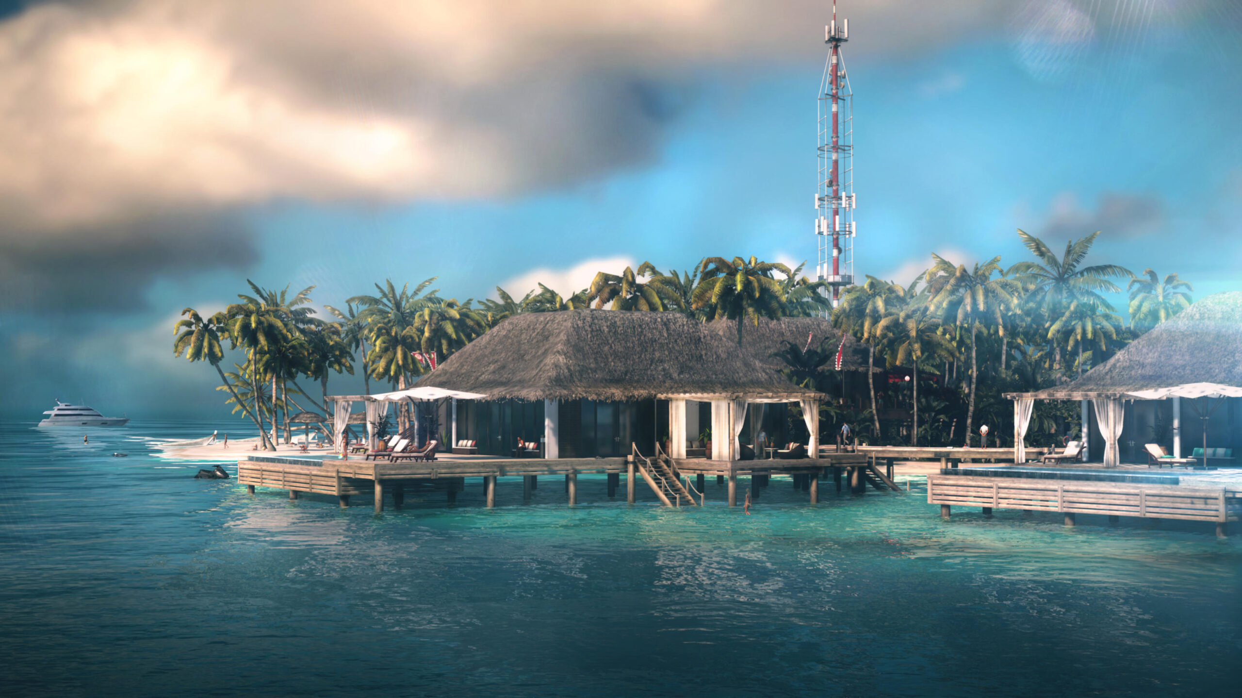
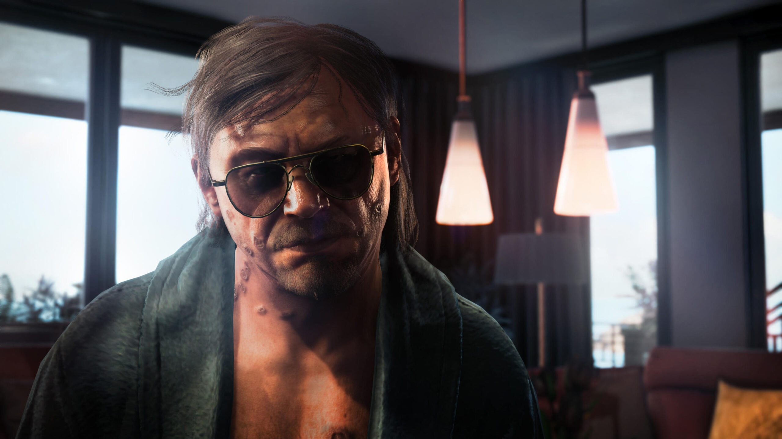
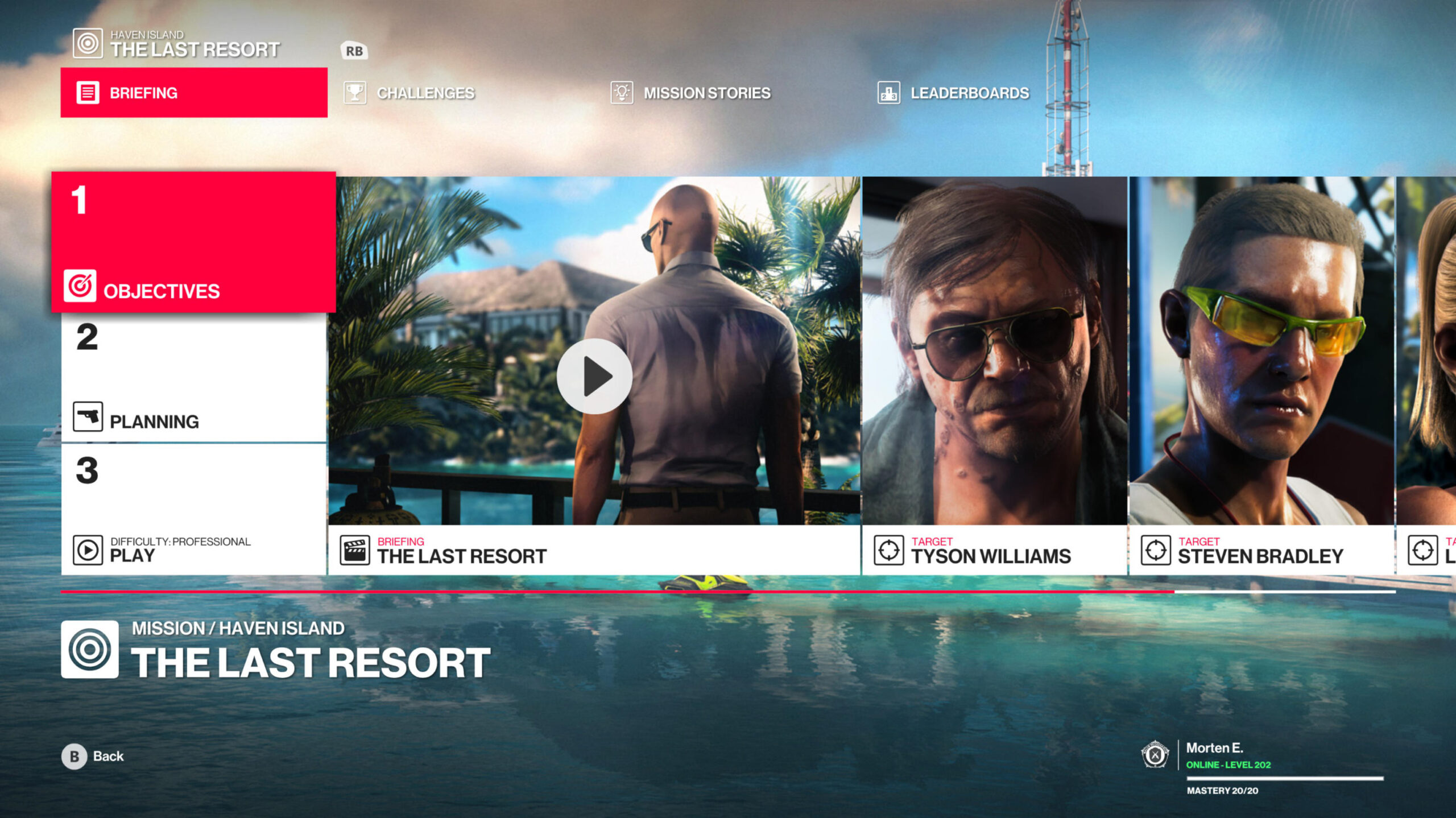
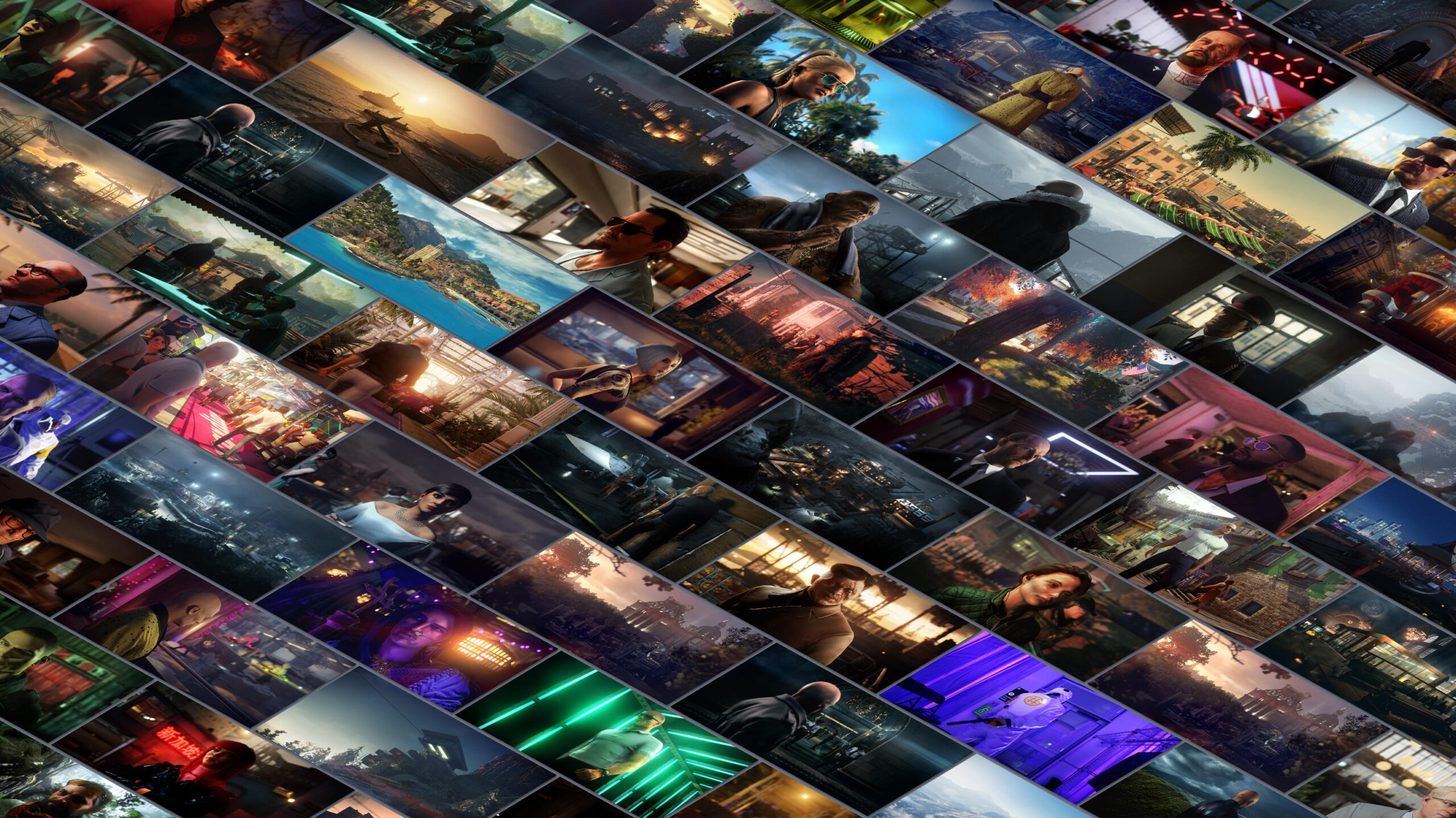
For HITMAN 2 I created screenshots for all mission stories, all target images, contract images. For the two DLC missions I created all images as well as for the sniper missions.
I also redid location, contract and target images for the previous HITMAN levels so they were up to the same standard.